

Are you sending out abandoned cart emails when your visitors leave something in their shopping cart? If not, you’re missing out on huge amounts of income.
According to the Baymard Institute an average of 69% of shoppers abandon their carts, costing online retailers an estimated $260 billion in lost revenue.
In the past, we’ve discussed ways to reduce shopping cart abandonment. One of the key tactics is to remind shoppers there’s something in the cart with an abandoned cart email.
The thing is, 3/4 of people who abandon their carts usually plan to come back, so if you’re not sending abandoned cart emails to jog their memory, you’re leaving serious money on the table.
Salesforce data show that 60% of shoppers returned to make a purchasewithin 24 hours of receiving personalized emails after abandoning their shopping carts.
19 Proven Ways to Reduce Cart Abandonment & Grow Your Revenue

Over 69% of shoppers abandon their carts and will never return!
Learn how to recover those lost sales and unlock the highest revenue from your eCommerce site!
DOWNLOAD NOW
How Many Abandoned Cart Emails Should I Send?
Most best practices for abandoned cart emails favor sending between 2 and 4 emails. Marketo suggests a sequence of three emails, with this timeline:
- Send the first email an hour after abandonment, to address technical barriers to completing the purchase.
- Send the second within 24 hours with a cart expiry warning.
- Send the third within 48 hours, with an incentive or reward for completing the purchase.
So, that’s the ideal timing, but what should these emails look like? We’ve scoured the web to collect the best abandoned cart email examples we could find. For each, we’ll say what we liked, and which aspects we thought could be improved.
By the end of this article, you’ll be able to use these examples to create your own abandoned cart email templates so you can start to recover revenue from shoppers with items left in the cart.
Let’s get started …
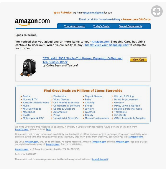
1. Amazon
Let’s kick things off with Amazon. As the world’s largest online retailer, following their example is a good bet. It’s pretty clear that Amazon follows a simple abandoned cart email template that works for any of their stores. (By the way, they also send abandoned search emails related to what you’ve been looking at.)
Source: Pinterest
What we liked:
- This is a very simple email that gets straight to the point.
- It reminds you where you were shopping.
- It includes a photo of the item left in the shopping cart as a reminder.
- There’s a link to the item so the recipient can head straight to checkout, removing obstacles to completing the purchase.
What we didn’t:
- The bottom of the email is busy. We wonder if there’s really a need to link to every Amazon store.
- We’d have loved to see an incentive for completing the purchase, like an additional discount. However, this approach clearly works for Amazon.
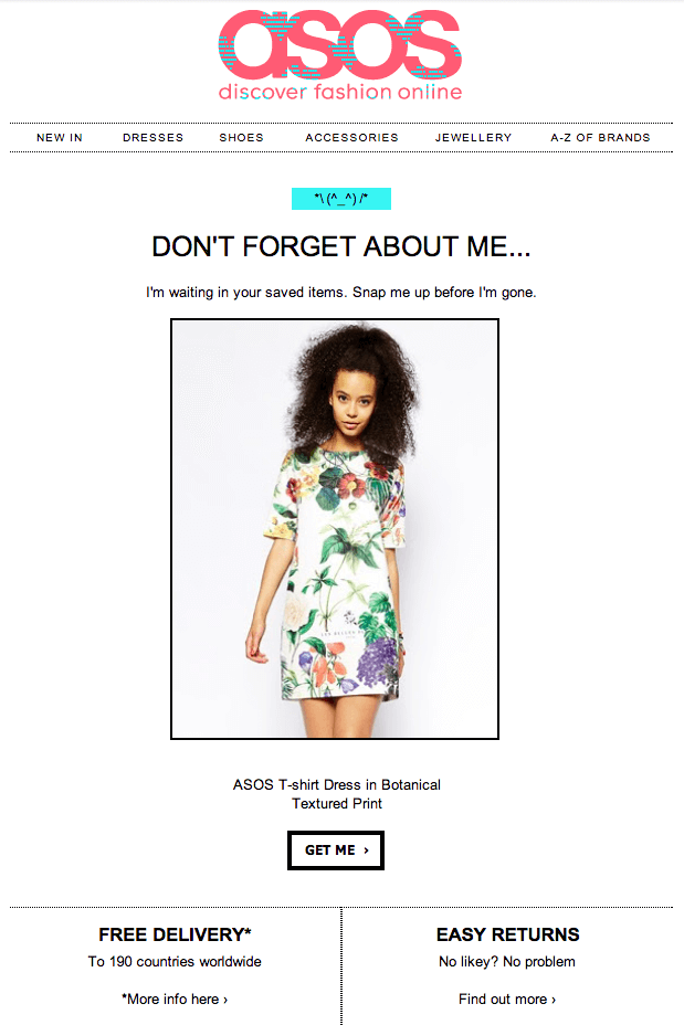
2. Asos
The abandoned cart email template from Asos is also pretty simple.
Source: Remarkety
What we liked:
- ASOS has nailed brand recognition with this email. It looks very similar to the store’s home page.
- The messaging is also on-brand, with some playful humor in the headline and copy. The ASOS marketers clearly know their buyer personas.
- The email includes a picture of the item in the cart to jog the recipient’s memory with a visual.
- The email reminds recipients that there’s free delivery and it’s easy to return items. This removes the risk of completing the sale, which will help with conversions.
What we didn’t:
- To be honest, we liked everything about this email from ASOS.
3. Barkbox
Barkbox injects some fun into this abandoned cart email example, and we think it works – mostly!

Source: MailCharts
What we liked:
- The GIF of an excited dog receiving the order is absolutely right for the audience, and guaranteed to get attention.
- There’s a reminder of what’s inside a typical Barkbox to reawaken recipients’ interest.
- The copy is cute: “show your dog some ruv” will melt any dog owner’s heart. This is mirrored by the cartoon drawings of dogs at the top and bottom of the email.
- The email includes identical two calls to action (CTAs) at the top and bottom of the email.
- There’s a cart expiry warning to trigger action based on urgency. This is usually a good marketing tactic.
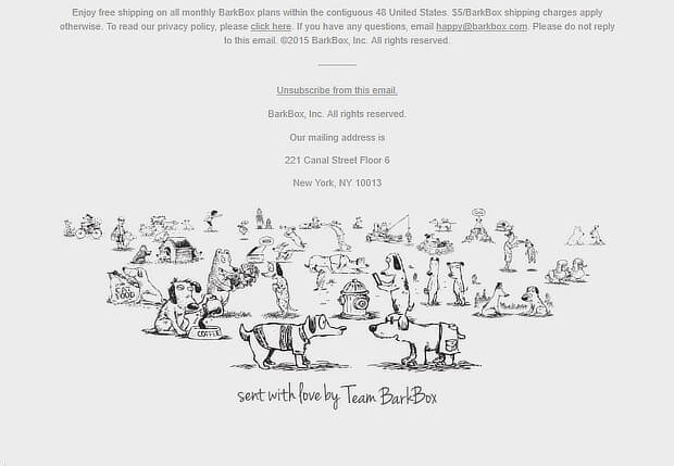
What we didn’t:
- One possible improvement would be to show the actual Barkbox the recipient ordered to make it more personal. In eCommerce, personalization helps to make sales.
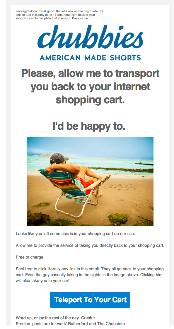
4. Chubbies
Does beachwear have anything to do with sci-fi? If you believe this example from Chubbies, there’s definitely a link.
Source: Current Commerce
What we liked:
- Chubbies clearly knows its audience. The words “transport” and “teleport” in the email subject line, copy, and CTA are designed to appeal to them.
- There’s humor throughout the copy in encouraging readers to go back to the cart.
- You can’t miss the CTA.
- There’s an eye-catching image early in the email, related to Chubbies’ products.
What we didn’t:
- Like the Barkbox example above, this would have been even better with a specific photo of the item in the recipient’s cart, but generally this email works.
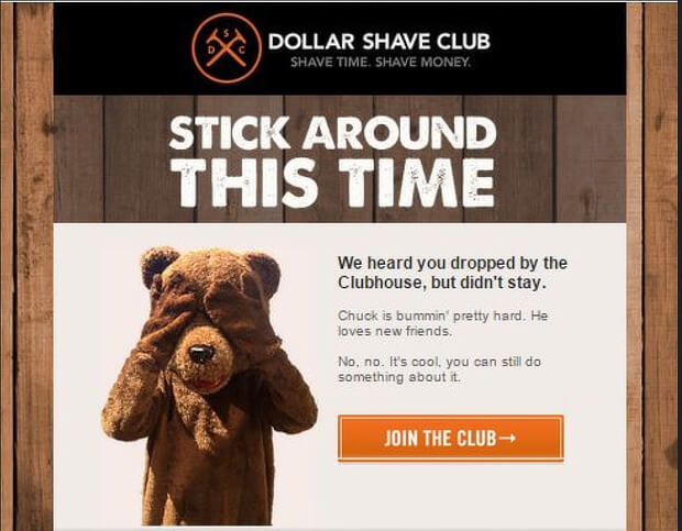
5. Dollar Shave Club
Dollar Shave Club is known for excellent marketing, so it’s no surprise that it’s one of the most appealing of our abandoned cart email examples.
Source: Pinterest
What we liked:
- The bear covering its eyes is intriguing and will encourage recipients to read the email.
- The copy is written in everyday, laid back language, which is perfect for the company’s audience.
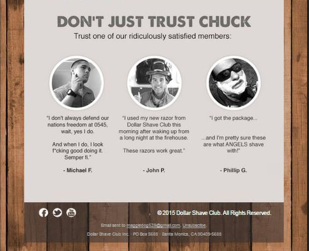
- This carries through to the customer testimonials, introduced with a “Don’t Just Trust Chuck” subhead.
- Overall, there’s a sense of fun and personality which really appeals.
What we didn’t:
- We’re probably nitpicking here, but maybe Dollar Shave Club could add another CTA under the testimonials for recipients who read that far down.
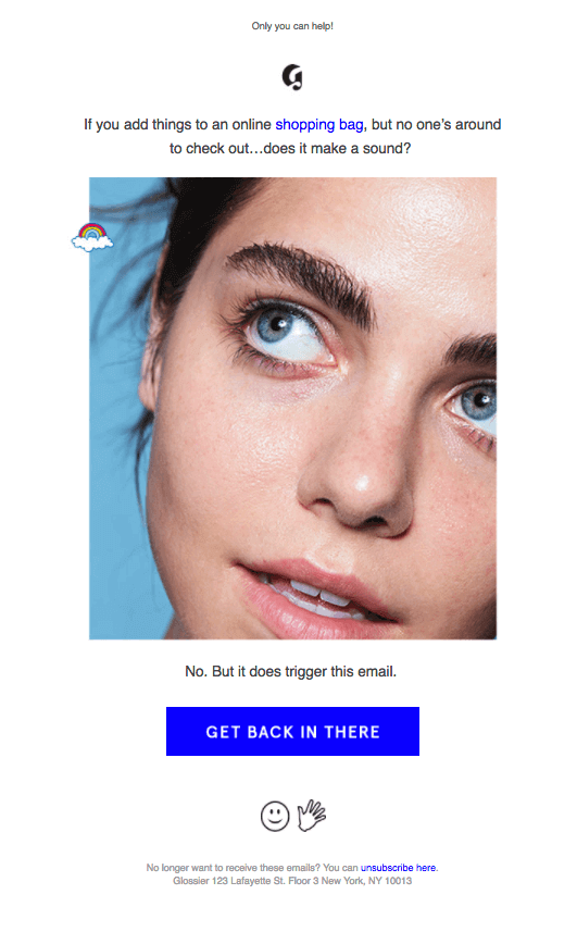
6. Glossier
Glossier’s got a pretty cool abandoned cart email, as you’ll see.
Source: Website Magazine
What we liked:
- Glossier’s upfront about the fact that this is an automatically triggered email, and plays with that in the copy.
- The eye-catching brand image is designed to get attention.
- It’s short and to the point, with an explicit link to the shopping back near the top of the email.
- The “Get back in there” CTA is amusing.
What we didn’t:
- It’d be worth testing if including an image of the item that’s in the cart makes a difference to conversions and sales.
7. Google
Google’s known for keeping things simple, and this cart abandonment email for a Google Photo Book is no exception.

What we liked:
- The email includes a photo from the book, and photos always get attention.
- The subject line reminds the recipient of the next stage in the process.
- The CTA is simple and clear.
What we didn’t:
- This email is almost too minimal.
- A bigger photo would get more attention.
8. Hayneedle
Home furnishings retailer Hayneedle knows how to sweeten the deal for shopping cart abandoners.
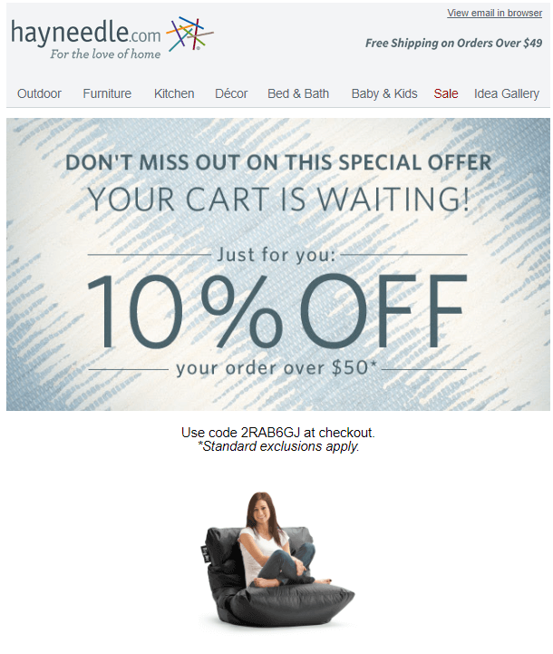
What we liked:
- The email highlights an incentive discount in the subject line and first image.
- There’s a reminder of what’s in the cart.
- The CTA highlights the benefit of completing the order.
- Their images of related products are on point – exactly what someone considering purchasing this item might want to look at.
What we didn’t:
- Actually, we liked everything. This cart abandonment email works.
9. J. Crew
Retailer J. Crew goes for simplicity with this abandoned cart email example.
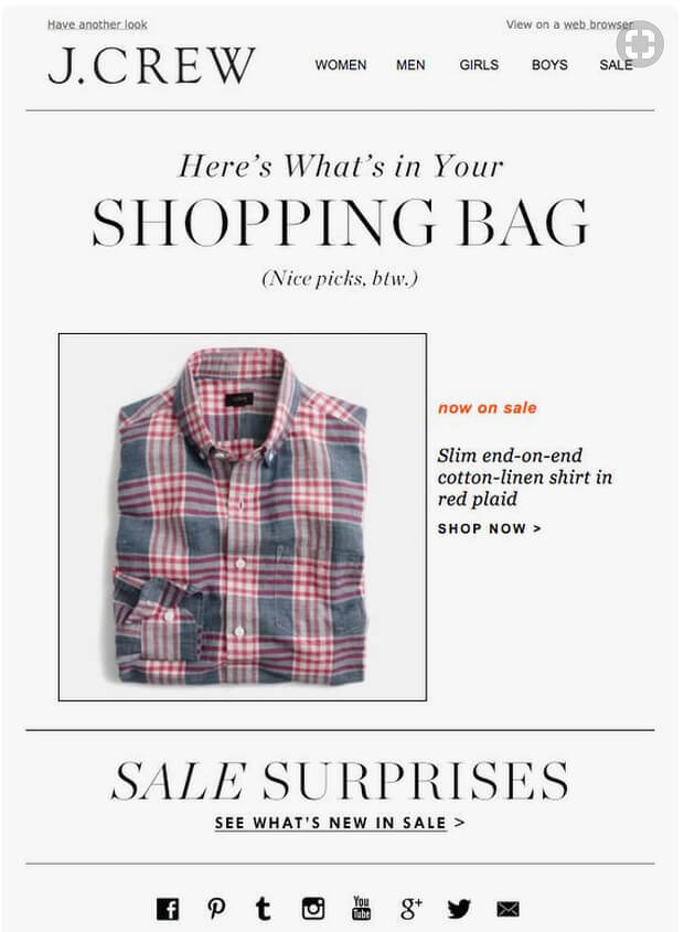
Source: Pinterest
What we liked:
- The email mimics the look of the main site, with menu links for the main shopping categories.
- There’s a large picture of the the item in the cart to remind the recipient what they were buying.
- The words “shopping bag” in caps are another instant reminder.
- The positive reinforcement of “Nice pics, btw” is designed to appeal to the retailer’s audience.
- The email tries to intrigue recipients by mentioning other items on sale.
What we didn’t:
- It could have been useful to mention a shipping incentive or show related items from the sale.
10. Jessops
As you’d expect, abandoned cart email examples from photography company Jessops take a more visual approach than most.
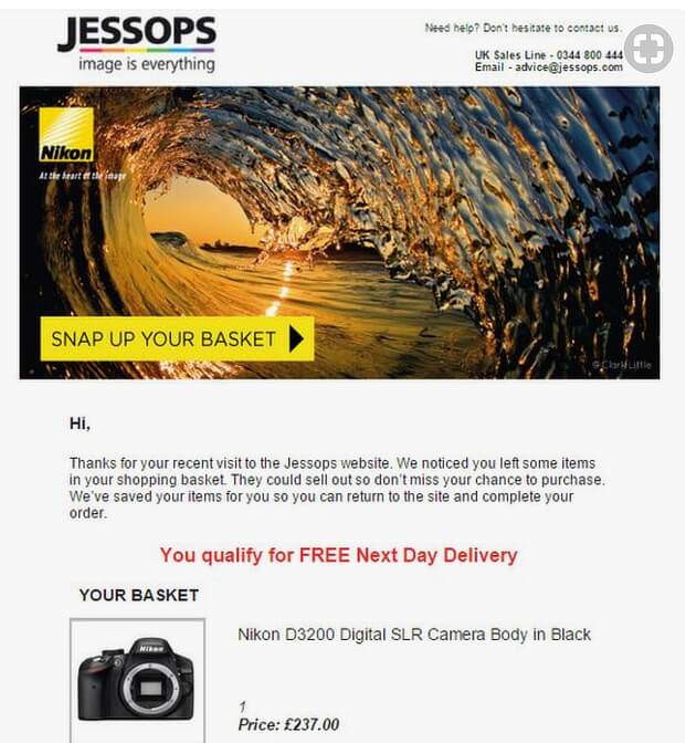
Source: Pinterest
What we liked:
- Killer images – every version of this we’ve seen has an eye-catching image right at the top.
- The “snap up your basket” CTA is a photography pun that will appeal to the audience.
- The email includes images of the items in the basket, followed by a regular CTA.
- There’s a reminder about free delivery as an incentive to complete the order.
- The bottom of the email includes boxes highlighting other Jessops features, and multiple payment options. Both of these may remind recipients why they were shopping there in the first place.
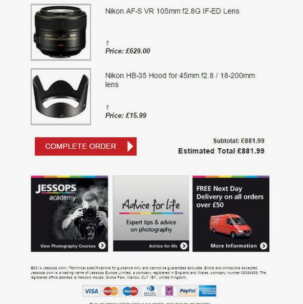
What we didn’t:
- It would have been good to use the shopper’s name in the email to get their attention even more.
- Links to the Jessops Academy and, presumably, the blog, seem wasted in an email going to someone who hasn’t completed a purchase yet.
11. Microsoft
This reminder from the Microsoft Store is pretty minimal.
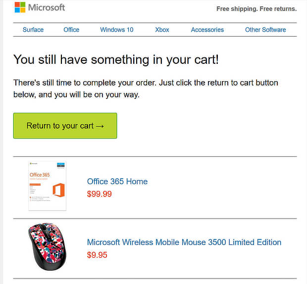
What we liked:
- There’s nothing to distract the recipient. Copy is short and to the point.
- There’s a visual reminder of the item in the cart.
- The abandoned cart email features a single, clear, CTA.
What we didn’t:
- There’s no incentive to complete the purchase, perhaps because this isn’t an expensive item.
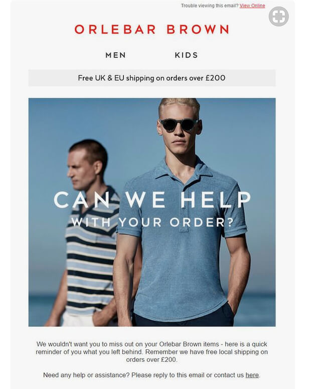
12. Orlebar Brown
Here’s an example from clothing retailer Orlebar Brown.
Source: Pinterest
What we liked:
- The main image is similar to images on the company’s website, reinforcing the brand.
- There’s a clear reminder of what’s in the cart.
- It shows where to get shipping and returns information.
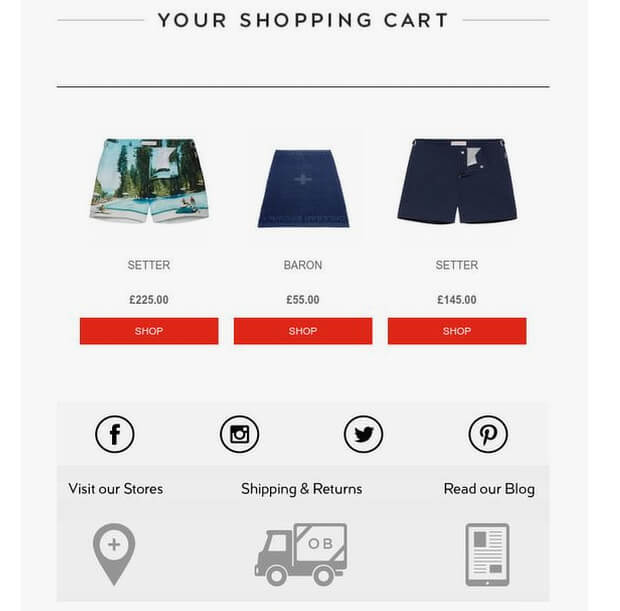
What we didn’t:
- The “Shop” CTA seems a little dull, and could easily be replaced by a single CTA going straight to the cart. Three identical buttons seems like overkill.
13. Pacsun
And here’s another example of an abandoned cart email from a clothing retailer, this time from Pacsun.

Source: Milled
What we liked:
- You can’t miss the headline.
- There’s a large image of the abandoned item.
- The “view my bag” CTA uses curiosity to encourage recipients back to the site.
- The copy uses urgency with the words “hurry back”.
- There are links to related items the recipient might like.
What we didn’t:

- We think the links in the top half of the email should all go back to the cart. In the example we looked at, the first image linked to the product page.
14. Russell Brunson
We haven’t yet had abandoned cart email examples for info-products, so here’s one from Russell Brunson for his Expert Secrets launch. There are four emails in the sequence, though we’ll look at the first one.
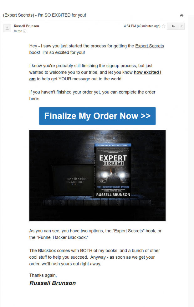
Source: Email Drips
What we liked:
- The subject line appeals to the emotions, explicitly trying to generate excitement.
- The copy is friendly and sounds like it’s one human being talking to another.
- There’s a big, bold, unmissable CTA to complete the order.
- The email copy reminds recipients what’s included in the deal.
What we didn’t:
- The email isn’t personalized, though that’s probably because the recipient hasn’t yet provided a name.
How to Make Your Abandonment Cart Email Templates More Effective
Now you have some inspiration for creating your own abandoned cart email templates, here’s a way to recover even more of those abandoned carts with OptinMonster.
You can use our page-level targeting feature to offer shoppers a discount when they return to the cart page. OptinMonster customer Scott Wyden used this technique to recover 21% of abandoned carts.
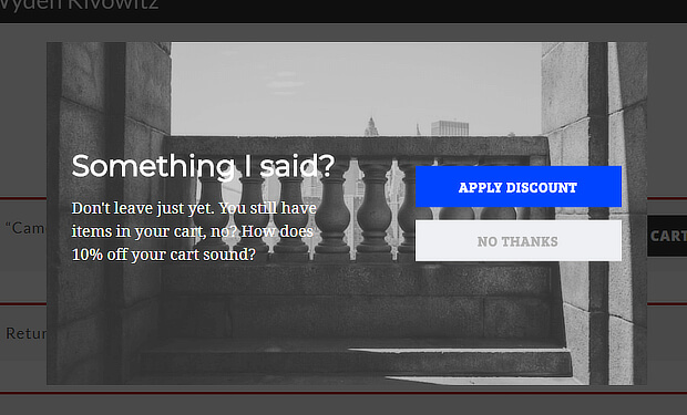
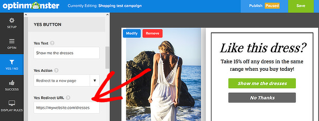
To do this for your own online store, follow our instructions for creating your first campaign. Enable the Yes/No buttons and let the Yes button redirect to your coupon URL, to apply the discount.
You can also boost your sales with an in-cart upsell popup, or improve average order value with these upselling tips. And don’t forget to follow us on Facebook and Twitter for more tips and guides.


No comments:
Post a Comment